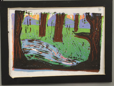
This is my isolated/final block print, it's supposed to be a nature scene with a river, trees, mountains, and a sunset. The sun is a mix of yellow , orange, with a little bit of pink. The mountains is a light purple color. The grass is an ombre effect of green, it's lighter closer to the mountains. The river is a light blue color, but still has some pink in it to show the sky reflecting. The river also has some brown and black in it from the trees where it wasn't carved out enough, I think it added a little bit of definition, or almost an outline, to the lake though. The trees are brown , the very front trees are black with brown detailing. The brown and black kind of got all over the place, I think this is because some parts weren't cut down all the way or something. I'm not really sure, even when I went over and carved out more the lines still seemed to show up. I think to some extent the messy colors is alright, when it lines up nicely it kind of looks like more trees. But at the same time not really, but nature isn't super neat and clean so, although I would prefer there wasn't any stray lines like that, I think it's okay.
The skill I used for this one, or rather the skill I learned for this one, is probably trying to line things up and make them print in the same area. I learned how to carve away what I wanted to stay that color. I definitely need more practice with printing, my prints didn't seem to line up nicely and I'm not really sure why that was happening so often. I felt like I was lining them up right, but when it came back it didn't really look like it.
An element or principal of design I learned, or used in this project, was color. I was trying to create color that would compliment each other. The final print didn't really have that but I think the yellow in the sky went nicely with the purple mountains. I want to say value but there wasn't a lot of it, there is some in the grass though.
I think what makes this interesting to look at is the messy look too it, especially in the lake. It seems almost hard to see the river due to the really dark colors on top of it, but I think it also gives a sense of which direction the river is going.
 |  |  |
 RSS Feed
