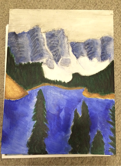
Our next assignment was to make a choice, any thing we wanted that related to what we already learned. I chose to do another landscape. It's a picture of mountains covered in snow, a lake, and trees. I used a light gray for the sky. The mountains are a dark gray blue with white for the snow. The trees are a variety of greens, the main one is dark green though with light green for details The lake is also a variety of blues, it was trying to show reflection but I don't think it really did but still looks nice.
The skill used for this project is value and color. I wanted to make it look like there was snow on the mountains. For this one, I wanted to show more detail and I think I did that.
The element or principal of design used is probably value. There isn't a ton because majority was used for detailing. But value is in the water and mountains.
I think what makes this interesting to look at is the colors. It's very light and maybe dull up top towards the mountains and then the ground and water looks a little brighter. I think the details in it also make it interesting to look at.
 RSS Feed
