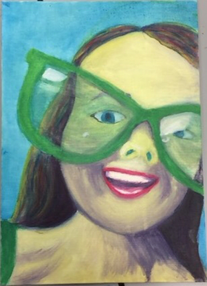
For this portrait, I used bright colors such as yellow, red, and blue (mixing those to get any other color I might need). I tried to stay away from using brown or black so that it looked more expressive and not like the muted portrait. This one is very different compared to the muted one. It has bright colors, the picture itself is moved to be more expressive.
The skill I used for this one is probably proportion and scale, trying to make the facial features the right size for the face and right angle. Another skill might be value, but with this one I didn't emphasis value as much as on the muted one. I used complimentary colors to try and add more color, or make other colors stand out more.
An element or principal of design I learned, or used in this project, was proportion and scale, value, and color. Each of which helped create the portrait, proportion and scale was used to make the portrait look some what realistic, the value helped make it look 3D, and the color made it expressive.
I think the color makes the portrait interesting, there's a lot of complimentary colors in this portrait especially in the hair.
 RSS Feed
