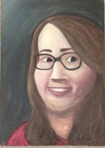
This is a portrait done in a renaissance type style. The colors used were brown, black, white, blue, red, and yellow.
With this project I learned how to better paint or draw faces in proportion. I also learned that to make the highlights stand out, you need to darken the shadows, it creates this contrast that helps them "pop".
A lot of emphasis was on the value and making it look more 3-dimensional rather than flat. Another design element or principal of design would probably proportion and scale, making sure everything is a reasonable size for the face or in the right area. These skills help create a more realistic portrait.
I think this is an interesting portrait to look at, because of all the shades or how dark it is, which makes the highlights stand out more.
 RSS Feed
