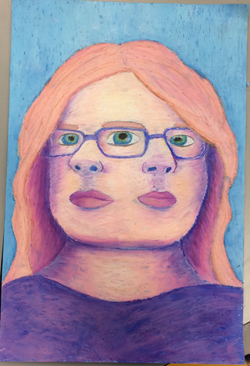
For this portrait, I tried to make it dark purple and fade to a pink color in the middle. I used purple, blue, pink/peach, yellow, brown, and a little bit of black.
The skill I used for this one is probably proportion and scale, trying to make the facial features the right size for the face and right angle. Another skill might be value, it isn't as emphasized in the face, but in the neck it is. I probably could have darken the shadows even more on the face and chin.
An element or principal of design I learned, or used in this project, was proportion and scale, value, and color. Each of which helped create the portrait. Proportion and scale was important in making sure that the features were in the right place, the value helped make it look 3D and added to the color, and the color, in general, made it stand out more, it made it look more like a non-traditional portrait. .
I think what makes this portrait interesting to look at is the fact that it's two 3/4 view heads put together.
 RSS Feed
