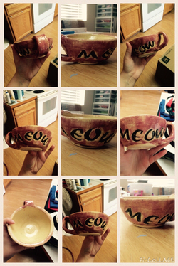
This was a tea cup I made for my sister, the glaze did not go on nicely this time but she likes it anyways. Which is great!
Rubric:
I can create a usable ceramic cup of uniform thickness - between 1/4” and 1/8” - on the potter’s wheel that is at least 5” tall and 3” wide. The base should be narrower than the lip. It needs to be light enough to be held up by the handle. I would give myself a four here.
I can pull and attach a handle so that it can be functional. The handle is a little off but it is usable, so I'd give myself a four here.
I can compress the lip so that is is a functional cup. I would give myself a five here.
I can glaze the project so that the form is enhanced and there is no glaze on the foot ring. I can chose a color and thickness of glaze so that it is usable. Create a unified project where the color, surface design, edge and all sculptural details will enhance the whole by reflecting or contrasting with the form. The color is really splotchy because of the way I did it (dipping and then trying to take it off for the lettering) but it does have a design and is fairly unified. So, I'd give myself a three here.
 RSS Feed
