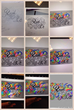
We were tasked with creating a logo for our website using our website name.
My tools included sketch paper, my regular pencil, an ipad, and the app SketchBook.
Starting from the top left to right, I first sketched out the different fonts and design I wanted for my logo. Then I took a picture of the sketch, put that into an app on the iPad. From there I traced the words and the curved lines. After tracing it, I began filling in the curves with color. I was unsure of what I wanted to do in the middle, if I wanted to attempt to connect the colors in the middle or if I wanted to try something different. I took a break from adding in rainbow colors and filled in the "write" with white. I then went back to coloring in the curves until that was all finished. I went back over the outlining to darken that and then lastly I filled in the areas that were white, from being erased, with gray. There is a bigger picture of both finals below (may not be seen until you click "read more".)
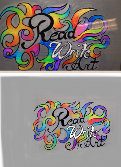
Above is a picture of both of my finals. The top one is my favorite so I set that one as my home page banner. The reason I had to make a new one was because it got deleted, I should have backed it up in case that did happen since we share iPads.
The reason I like the top one more is because I spent an entire week on that one whereas with the other one I only had a day due to iPad technical difficulties. I also prefer how the color looked in that one, it looked more gradient and not as choppy as the other one. Probably because I could spend a long time on one section whereas on the other I felt some what rushed.
They don't look very different though, I do like the bottom one because in some areas the choppy coloring looks neat. But, in some areas I don't like how the curved lines look. So, I like both but my favorite is the top picture.
 RSS Feed
